# A modern picture showcase using CSS
I am a big fan of [Andy Bell's "Be the browser's mentor, not its micromanager](https://bell.bz/be-the-browsers-mentor-not-its-micromanager/). This is one of my central principles when implementing UIs using HTML and CSS. I transferred this idea into various [layout patterns](https://feo.crinkles.dev/layouts/) in my own CSS library [Feo.css](https://feo.crinkles.dev/). But sometimes (more than I like to admit) we all need to create precise layouts, especially in marketing-heavy websites, or complex web applications.
## The picture showcase
One of the more recent requests I got from a client was to create what I call a _picture showcase_. The inspiration I was given to recreate came from [Airbnb](https://www.airbnb.com/rooms/47118372). Simply put: “_Create a showcase where there is one big picture, and four small ones_”. Like the screenshot from Airbnb below.
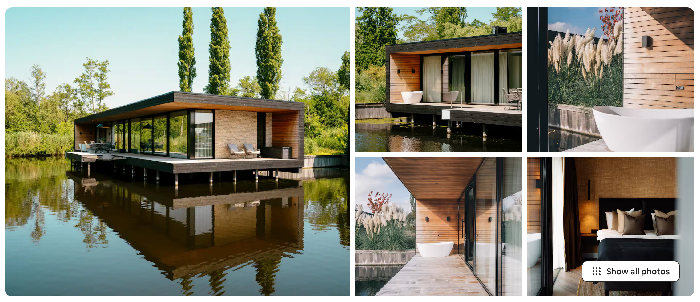
Who can object to this type of request? It is a nice and clean implementation to show a quick overview of five beautiful pictures that the user can click on. You can only assume that UI decisions and patterns like these can boost your success, as it works for Airbnb as well.
## Recreating it in CSS
My preferred way to recreate this is by using `grid-template-areas`. It allows you to visually, in your code, implement the exact layout as you see. One caveat is that you need to assign each of the areas explicitly to the items. But this can be achieved by utilizing the `:nth-child()` selector.
```css
.showcase {
display: grid;
grid-template-areas:
"a a b c"
"a a d e";
}
.showcase > *:nth-child(1) {
grid-area: a;
}
.showcase > *:nth-child(2) {
grid-area: b;
}
...
```
And we if apply this snippet of CSS, we get this live example!
## But what if we do not have exactly five items?
But let’s be honest. Most clients want to see a robust, but flexible system. They don’t want to force users to upload five pictures exactly. The Airbnb screenshot already shows a “show all photos” button. This suggests there are more than five. But systems should be created where only two, or three photos are possible as well.
Now you might think that it would be possible when implementing a different type of grid. For instance use template columns instead of areas, like the snippet below. But in practice, most of us will encounter issues with this, or a different approach. In reality, I almost always have a `gap` defined. If the last column did not have any items and no width, I would still get the gap.
```css
grid-template-columns: repeat(4, auto);
```
No, we need to find a way to make the solution more robust for different cases, while utilizing the powers of template areas. We have to solve the following issues.
- What happens if there are six or more items?
- What happens if there are four or fewer items?
- What happens on smaller screens?
## Hiding the overflow of items
Ok, let’s start with an easy one. We want to hide all items of the `.showcase` that have an index larger than five. Of course, we can solve this with modern JavaScript frameworks by just not attaching the HTML to the DOM. But that is not the challenge here! We want to solve it with CSS.
```css
/* hide all 6th or more items */
.showcase > *:nth-child(n + 6) {
display: none;
}
```
Just to make it clear. It is better to **not** visually hide the pictures. It is better if they are not attached to the DOM at all. If pictures are only visually hidden, they will still get loaded over the network. But we have learned how to hide an overflow of elements. We can easily apply this approach in cases not related to pictures.
## Adjusting the showcase for fewer items
We managed the overflow of items. But what if there are fewer items on the screen? The expected layout pattern works for five and is acceptable for four items. But you would get one or two empty columns for anything less. We need to find a solution for most of these variations.
The best approach is using the [_cascading_](https://web.dev/learn/css/the-cascade) nature of CSS. We define the most simple case, a single item, and we are going to define each case with more items below it. So let’s discard our old implementation and define a grid area for a single item!
```css
/* fallback for only 1 item */
.showcase {
grid-template-area: "a";
}
```
Ok, that was a little too easy, but it does the trick. But now we have to define a grid area in case we have two, three, or more items. This means we need to know how many _descendants_ `.showcase` has. A few years ago this was impossible. But thanks to the `:has` selector we can do this. We can use something similar to the [_counted trick_](/writing/use-the-child-element-count-in-css/). Using this trick we can target `.showcase` in a way.
```css
/* .showcase has (at least) 2 items */
.showcase:has(> *:nth-child(2)) {
grid-template-area: "a b";
}
```
And in the same way, we can now define a template area when there are three items in our showcase.
```css
/* .showcase has (at least) 3 items */
.showcase:has(> *:nth-child(3)) {
grid-template-area:
"a a b"
"a a c";
}
```
It is important to remember the _cascading_ nature of CSS. The `:has(> *:nth-child(2))` selector is true for all showcases with _two or more_ items. It is a hard check on the existence of a second item. However, it does not check the index of the last item. That’s why you have to define the cases with more items later in your CSS. Knowing this, we can define the last case, four or more items, with the template area we had at the beginning.
```css
/* showcase with 4 or more items */
.showcase:has(> *:nth-child(n + 4)) {
grid-template-area:
"a a b c"
"a a d e";
}
```
## Adjustments based on screen sizes
We’ve now tackled two out of the three use cases to make our picture showcase. But One thing you will quickly notice is that our original UI looks poor on mobile devices. The four small pictures are just too small. So we need to be able to adapt our layout pattern to various screen sizes. And what better way than to use media queries?
To make it simple, we are going to adapt the UI to one big and two small items. But in this case, the small items will be positioned below the bigger one. This also means that in this case we need to hide all fourth and above items.
```css
@media only screen and (max-width: 676px) {
.showcase:has(> *:nth-child(n + 2)) {
grid-template-areas:
"a a"
"b c";
}
.showcase > *:nth-child(n + 4) {
display: none;
}
}
```
## Wrapping up
And voila! We are done. We now have an adaptable picture showcase that can work with different configurations and screen sizes. We have learned how to combine grid template areas and how they allow us to quickly adapt to various different use cases. Especially when combined with `:has` and media queries. Curious to see if all of this really works. Head to this [codepen](https://codepen.io/thecrinkles/pen/xbKPjza) to see for yourself.