# Creating a stacked bar chart using only CSS
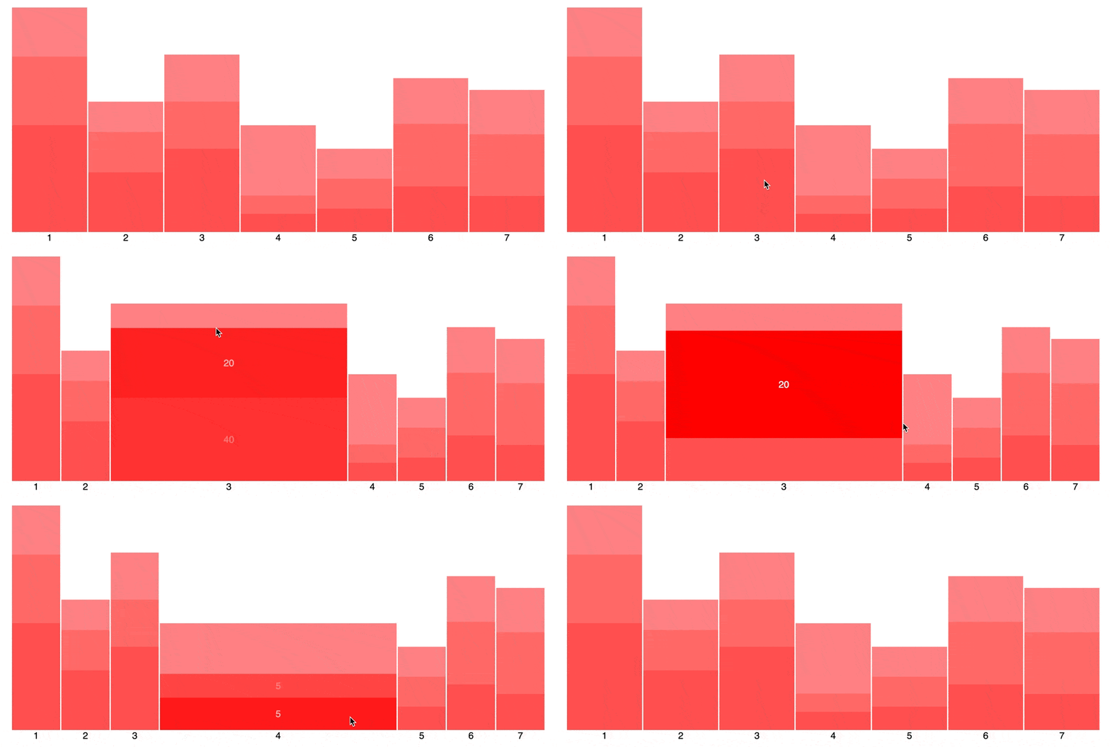
In various projects, I always seem to struggle with responsive charts. These libraries generate charts in SVGs, often with fixed dimensions or ratios. This means that different screen sizes either get additional whitespace, or parts of the chart get hidden. Horrible. So I gave myself a challenge to create a responsive CSS-only bar chart, the one visualized below.
## The base of the chart
Alright, let’s first make the graph itself. The graph is nothing more than multiple bars aligned horizontally. Or, you know, in a `row`. As we want all the bars to stick to the bottom, we need to set `align-items: flex-end`. Floating bars from the top look cool, but in the end, add little value to most charts. The `gap` is needed to tell each of the bars apart.
```css
.chart {
display: flex;
flex-direction: row;
align-items: flex-end;
gap: 2px;
}
```
```html
```
Now we can start defining our bars. Each of the bars is a vertical stack of sections. So, a flexbox with the direction `column` would suffice. With the `flex-grow: 1` we ensure the bars fill up all the available horizontal space equally. As you can see in the example, we do expect that a bar that is being hovered gets more space. This allows us to display values with the bar the user is (kinda) interacting with.
```css
.bar {
display: flex;
flex-direction: column;
flex-grow: 1;
}
.bar:hover {
flex-grow: 6;
}
```
## The size of the bars
Now we only need to determine the height of each of the bars. Ideally, I would have liked to use a `data-*` attribute. Reading values in CSS from these attributes can be done using the `attr()` function, as it only works with string values, and. But unfortunately, that will not work.
::: callout
The `attr()` function can only work with string values. This means it only has value for the `content` attribute in CSS.
:::
The only way I could make it work is by adjusting custom properties via the `style` attribute on the HTML element, like shown below. It’s not a solution I prefer, but for our use case, it does work. And combined with modern JavaScript frameworks it is often hidden for developers in custom UI components.
```html
```
As you can see in both the HTML snippet above and the CSS snippet below, we are working with percentages. To have the chart scale nicely, we need to give the bar with the highest value a height of `100%`, and all others scale according to their values.
```css
.bar {
height: var(--bar-ratio, 0%);
}
```
## Stacking the bars
As we are looking at a stacked bar chart, we need to add sections to each of the bars. We already know that a bar is set up as a vertical flexbox. To ensure each section fills up the space of the bar corresponding to their value. If we have three sections with values `10`, `20`, and `30`, we can achieve the result to set `flex-grow` to this value. In summary, `flex-grow: var(--value)`. Like with the height of the bar, we need to inject the value through the `style=“--value: 30;”` tag.
::: callout
If the value is small compared to the other sections, other CSS attributes, such as padding, might impact the correct distribution.
:::
```css
.section {
display: flex;
flex-grow: var(--value);
}
.section:hover {
flex-grow: calc(10 * var(--value));
}
```
From a user experience perspective, we want to highlight the section on interactivity, i.e. hover. By simply expanding the `flex-grow`, just like with the bar, we get the effect that we want. Both the bar within the entire chart, as the section in the bar is expanding in size on hover.
## Improve the experience
Stacked bar charts visualize different series of data. Each nth section of a bar belongs to the same series of data. This means we need to have a way to indicate that they belong to each other. In most libraries, you can define a set of colors. But I wanted a more CSS-only solution. I already deviated from this by setting values through the `style` attribute. So I want to avoid more deviation.
A nifty little trick that I learned is setting a `--nth-child` custom property in the root of your styling, as shown below. This makes it possible to use these values with the `calc()` function.
::: callout
You might think using `:nth-child(n)` would allow you to achieve the same, without all the custom properties. Unfortunately, the `n` is not useable in the `calc()` function.
:::
```css
:nth-child(1) {
--nth-child: 1;
}
:nth-child(2) {
--nth-child: 2;
}
...
```
::: callout
If you have different types of children within a parent, you can use `:nth-of-type`. This does target HTML tags. If you only use `` it will make no difference.
:::
Now we have a variable that we can use to indicate the index of an element. We can use math to visualize sections of the same series. Examples are `background-color` or `opacity`. Let’s go for background-color. The easiest way would be to use the `hsl()` function and change the degrees of the colors, as shown below. As there are 256 degrees, taking a base of 100 gives us at least six different colors, before colors (almost) start looking the same.
```css
.section {
background-color: hsl(calc(100 * var(--nth-child)) 100% 40%);
}
```
## Wrapping up
By combining different forms of flexbox, `:hover` and some small tricks, we can create a nice responsive bar chart. The only downside is you need to bind the values via the `style` attribute in the HTML templates. This should not be an issue in most modern frameworks. But, it is still something to be aware of. Curious about the live example? Then visit [this codepen.io](https://codepen.io/thecrinkles/pen/QWaQVMb) link.