Combining :has and :only-child to change tab containers
Two of the quirkiest and most fun CSS tricks I have discovered have to do with counting. Or more specifically, changing styles based on the number of child elements or the index of a child element. Recently I had to implement some styling details related to those tricks. But not quite. The previous tricks encouraged me to look for a CSS-only solution. And I found it!
This trick uses the new :has selector in CSS. The majority of browsers support this selector at the time of writing. But, Firefox only recently added this feature in the stable releases.
What did I want to achieve? #
Most of us have seen them, and have implemented them: tab-containers with rounded corners. Everything is fun and game when you start implementing them. You create this beautiful wrapper with the buttons to switch the tabs at the top. The highlighted button has nice rounded corners. But only at the top part. The content fits nicely with the row of buttons. It has the same rounded corners but at the bottom. It is one nicely integrated and consistent UI.
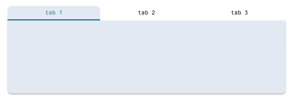
You created this reusable component in your framework of choice and sprinkled some CSS on it. And now it works everywhere, right? But then reality hits you. The pages this component is being implemented on have a dynamic number of tabs. Meaning that at runtime JavaScript is determining the number of tabs that need to be displayed, for various reasons. Maybe certain roles should not see certain tabs? Who knows. But you will encounter it. Now your generic UI component looks something like this...
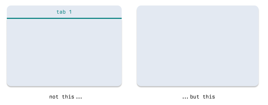
But that was not what we intended. Showing a tab container (including the button) if there is only one 'tab' available is redundant. Let alone confusing and probably inconsistent with pages that only have a single 'content' by default. Well damn... we just want a 'card' in this case.
Why not use X? #
When you use one of the modern front-end frameworks, you should have little trouble implementing a fix. You can add custom logic to count the amount of tabs the container will have. Based on that exercise, you can remove certain elements from the screens (e.g. the tab buttons) and add different classes to the content.
I think this would be the go-to solution for most developers. A year ago this would be my go-to solution as well. However, depending on the size of your application, it might not be ideal. If there are multiple reasons for determining the number of tabs at runtime, you need to write more and more logic. Each case requires its logic and probably a set of if-statements to come to the correct styling.
The CSS-only implementation #
As said in the introduction, the other CSS tricks and recent language enhancements encouraged me to look at a generic CSS-only solution. But no complex CSS solution can be achieved without a little bit of structure. Or you know, HTML. So let's assume we build the structure of our tab container like the snippet below.
<div class="tabs">
  <nav>
    <ul>
      <li>Tab 1</li>
      <li>Tab 2</li>
    </ul>
  </nav>
  <div class="content">...</div>
</div>
I am not going to explain all the CSS required to achieve the styling as indicated by the examples. But just what is necessary to understand the context of the trick. In this little snippet, we set the border-radius of the .content just to the bottom two corners. The top corners do not get any radius, like in our example.
.tabs .content {
  border-radius: 0 0 16px 16px;
}
So now let's look at the case where we only have a single tab. Or when looking at the HTML structure, when the nav and ul only have a single li. There already exists a CSS selector that can help us with that, the :only-child selector. When we set li:only-child we can change the style of this specific li element.
But that is not exactly what we want to achieve. For the intended effect, we want to 'remove' the nav element from the DOM, and change the styling of .content. With the recent addition of :has we can achieve this effect!
.tabs:has(nav ul li:only-child) nav {
  display: none;
}

.tabs:has(nav ul li:only-child) .content {
  border-radius: 16px;
}
In the first part of the above snippet, we effectively say: "Look for a .tabs that has a li element that is the only child of its parent". Now instead of styling a li element, we can style .tabs under this specific condition. Because li can also be part of .content we make it a little bit more specific by stating nav ul li:only-child. But the effect remains the same.
Wrapping up #
The beauty of this approach is that is generic, and simple. If users are using an older browser, things will not break. They will just see styling that is a little bit off, but is still functional. A nice case of progressive enhancement if you ask me.