A nth-child CSS trick
Sometimes you figure out a cool trick that just feels so powerful. It opens you up to a range of new possibilities. That you, quite frankly, rarely use. But still, it is a cool trick. For me, the latest of these tricks is setting a CSS custom property value, corresponding with the :nth-child value. Why? Because now we can use the --index custom property inside calc() functions.
But why not use X? #
Sure, in most, if not all, of my projects I use SCSS instead of CSS. But CSS is getting more and more features, making SCSS redundant for me. Looking at you CSS nesting. With each trick or implementation, you can remove another dependency on SCSS, and go back to plain CSS. Using @for-loops makes it easy to achieve the same result. But you will generate roughly the same CSS selector several times.
You might also think using :nth-child(n) would allow you to achieve the same, without all the custom properties. Unfortunately, the n is not useable in the calc() function. So, we use custom properties.
Lastly, there is also the counter() function, as pointed out by Šime Vidas. This is a powerful function that has a lot of other attributes that can be set, like a reset of the counter. However, this one is also not available in the calc() function.
How to set it up #
On the highest level of your CSS, you define a list like the one below. This results in all elements having access to a --index custom property. At least as long as you don’t exceed the length of your list.
:nth-child(1) {
  --index: 1;
}
:nth-child(2) {
  --index: 2;
}

:nth-last-child(1) {
  --rev-index: 1;
}
:nth-last-child(2) {
  --rev-index: 2;
}
What can we do with this trick? #
Glad you asked! In the last few years, I came across two use cases. Two, whole, use cases. In the latest use case, I wanted to automatically generate a color palette. Not to match a branding of a company. But to automatically populate different series of data in a chart. With this trick, we can do that with a single line.
.my-class {
background-color: hsl(calc(100 * var(--index)) 100% 40%);
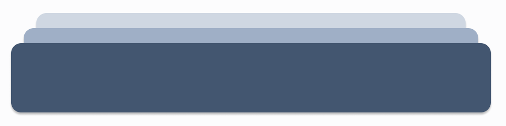
}In an earlier use case, I replicated the UI implementation of toasts from Vercel. On the link, you see a list of toast messages stacked with a little bit of perspective. I originally used an SCSS implementation, looking like the snippet below. Note it uses :nth-last-of-type, given the reversed order and bottom orientation. But the general idea remains the same.
@for $i from 1 through 20 {
  &:nth-of-type(#{$i}) {
    opacity: 1 - 0.15 * ($i - 1);
    transform: translate3d(50%, 0 - (5 * ($i - 1)) + px, -1 * $i + px)
      scale(1 - (0.05 * ($i - 1)));
  }
}
This would create twenty different CSS selectors, all with a different value for $i. But using this little trick, we can reduce the code, and make it more maintainable in the process.
.class {
	/* We want to start counting at 0 */
	--v: var(--rev-index) - 1;
	opacity: 1 - calc(var(--v) * 0.15);
	transform:
		translate3d(
			50%,
			calc(-5px * var(--v)),
			calc(-1px * var(--v))
		scale(calc(1 - var(--v) * 0.05);
}
That was it. That was my latest CSS trick.
Check also my latest trick Use the child-element count in CSS.