Use the child-element count in CSS
Recently I shared a nice CSS trick allowing you to use a CSS custom property indicating the index of an element. Now I want to share with you a trick for doing the reverse. A trick that allows you to use the child-element count on your parent selector. Let’s dive in!
This trick uses the new :has selector in CSS. The majority of browsers support this selector at the time of writing. Except for Firefox and Samsung browsers. In Firefox, this CSS feature is behind a feature flag in the advanced settings.
How to set it up #
In the previous trick, I showed how to set a custom property on an element indicating its index. But what if we want to know how many children a certain selector has? Originally this was never possible with CSS. The way it worked ensured that you could only look up, to ascendant selectors. But for the child count, we need to be able to look at the descendants. With the introduction of :has() we are now able to do that. Like with the --index of the previous trick, we can
now set global --count values applied to all selectors.
:has(> *:nth-child(1)) {
  --count: 1;
}

:has(> *:nth-child(2)) {
  --count: 2;
}

:has(> *:nth-child(3)) {
  --count: 3;
}
If we extend this list of global selectors, we can give (almost) all elements a --count and --index. This opens so many possibilities for powerful logic and dynamic layouts. In the end, smaller and easier to maintain code bases.
But why not use X? #
Depending on your use case, some alternatives allow you to achieve almost the same results. For instance, if you use the --count value not on the parent selector, but on the child selector (e.g. setting the max-width property). If that is your use case, you could use selectors like those shown below.
* ~ *:nth-child(2) {
  --count: 2;
}
* ~ *:nth-child(3) {
  --count: 3;
}
If you are living on the edge and using the --count for layout-specific cases, you can try using container queries. The browser support is a little bit better compared to :has(), but there are still browsers not supporting it.
Lastly, you can use manual utility classes to set the --count value. This is the safest option as it is supported by all modern browsers. The biggest problem though, you have to manually set the classes on the parent selectors. This means that this method is a lot more error-prone. The advantage is that the --count is set when you need it.
.--count-1 {
  --count: 1;
}
.--count-2 {
  --count: 2;
}
.--count-3 {
  --count: 3;
}
What can we do with this trick? #
The smallest use case I know is using this trick to show a counter of the number of child elements in a ::before or ::after. You can achieve this by setting content: var(--count). Note that if you want to do this, --count needs to be a string instead of a number.
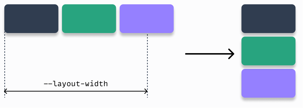
But, the trick shines when working with complex layouts. My favorite use case is the switcher layout of Every Layout. The way the original implementation works is that you determine a breaking point where the layout switches from horizontal to vertical. Without any specific media queries. I have illustrated its work below.
.switcher {
  display: flex;
  flex-wrap: wrap;
}

.switcher > * {
  flex-basis: calc(var(--layout-threshold) - 100%) * 999);
  flex-grow: 1;
}
With the --count trick, we can make this layout pattern more powerful. Instead of setting the breaking point on the parent, we can determine the breaking point of its children. We determine the minimum size we want the child elements to have, and update the flex-basis to the line below. Now we can re-use the .switcher class for a new use case.
.switcher > * {
	flex-basis: calc(var(--child-width) * var(--count) - 100%) * 999);
}
Wrapping up #
That is my latest CSS trick! Know that this trick is not supported in all browsers yet. Use it with caution. Soon though, we can all enjoy these powerful tricks together.