Hiding side content in responsive design
I always love solutions that allow me to achieve the same results where others choose for media queries. I am not opposed to media queries. But, in line with Andy Bell’s be the browser’s mentor, not its micro-manager, I feel media queries are very specific rules. We can live (mostly) without them!
How does it work? #
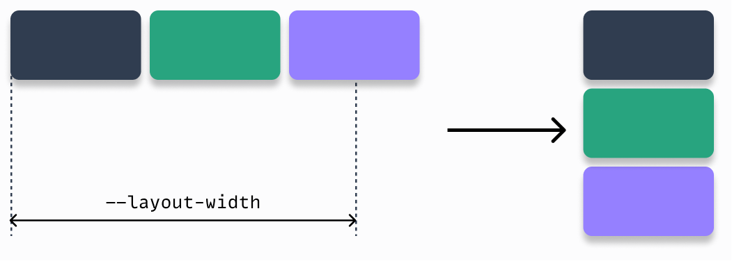
There are two types of responsive layout patterns I can think of where you can use this trick. It’s the switcher and sidebar patterns from Every Layout. Both layouts automatically switch from horizontal to vertical if there is not enough room left to uphold the conditions. Below is an illustration of the switcher layout below.
Both these layout patterns do not use media queries to achieve their results. The boundary condition in both these patterns is that they start with a wrapper like the one below.
.my-layout {
display: flex;
flex-wrap: wrap;
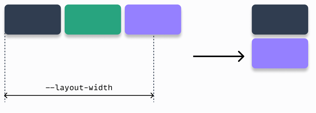
}But what if we want to hide one block when we switch to the vertical layout? So in the example below, we want to hide the middle block when we have a smaller screen. Traditionally, we would write a hiding mechanism using media queries (e.g. @media(max-width: 20rem). But there is a way around it.
For this explanation, let’s assume that this block is an aside element. To make this work, we need to build our HTML like the snippet below. Yes, you need one additional level inside the aside element.
<div class="my-layout">
  <div>...</div>
  <aside><div>...</div></aside>
  <div>...</div>
</div>
We start with adding an align-self: stretch on the aside element. This ensures that in a horizontal orientation, the aside assumes the height of the entire row. Next, we add position: relative on the aside and a position: absolute on its child. Combined with the inset: 0, we ensure that aside > * is usable in a horizontal orientation. The horizontal orientation is now complete.
Now for the vertical orientation. With the position attributes ensure aside has no calculated height in a vertical orientation. The child is taken out of flow due to the absolute value. By adding an overflow: hidden to the aside, we ensure that the child content is hidden in a vertical orientation. You know, due to the zero
calculated height. Combined it would look like the code below.
.my-layout > aside {
  align-self: stretch;
  position: relative;
  overflow: hidden;
}

.my-layout > aside > * {
  position: absolute;
  inset: 0;
}
Gotchas #
As said, this is a very specific trick, that has a few gotchas.
- If you set a height or min-height on the “parent” it will not work. Once it wraps to a new line, the side content will still be visible.
- when you set a gap on the wrapper, you will have an unwanted side effect once the content wraps to new lines. Although the side content is not visible, it is part of the DOM. This means that a vertical gap will be applied. Creating a kind of margin-bottom effect.
Although the use case is limited and the gotchas add more limitations, it does have some usage.
Update 28-02-2023
This trick also works if we want to reverse horizontal and vertical. If there is no width on the horizontal orientation, the content gets hidden. In vertical orientation, it can fill the available space, or have a fixed height.