Different approaches to fluid typography and layouts
With the support of the CSS clamp() function, a whole new range of fluid layout possibilities are available to us. Most notable is Utopia.fyi. This is a tool that generates different fluid values for typography and spacing/sizing that we can assign to custom properties. It is a tremendous tool and way to make layouts fluidly scale with the available screen we have. Even this website is built using a fluid layout and typography principles.
How does fluid sizing work? #
The generated code is hard to read and manage. At least, I find it hard to read. Look at the snippet below. I understand the minimum and maximum values. But how to reproduce the second parameter is much harder to understand.
:root {
  --step--1: clamp(0.75rem, calc(0.7rem + 0.26vw), 0.9rem);
  --step-0: clamp(1rem, calc(0.93rem + 0.35vw), 1.2rem);
  --step-1: clamp(1.33rem, calc(1.24rem + 0.46vw), 1.6rem);
}
Why not let the font size and spacing values scale with the screen? Why use the min and max values? Good question! The reason is reliability. Mainly on very large screens. It becomes hard to guarantee a reliable experience on all different screen sizes, especially around the edges. By controlling the values, we can achieve reliability much easier.
To reproduce the second parameter, the one with the calc(), we have to dive a little bit into basic mathematics. But first, let’s visualize what is happening. What we try to achieve is fairly simple. We want our values to increase when the available screen increases. There are two conditions though. We do not want our value to become below or above a certain value when the screen becomes too small or too big.
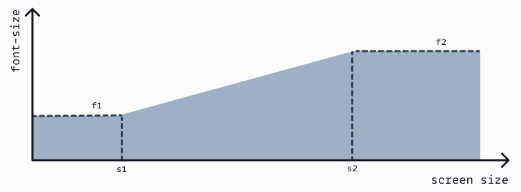
We now have determined how we want our font sizes or spacing to act on different screen sizes. We even have specific values we can use as a reference, the f- and s- values. Combined these two give two points of reference in our visualization: (s1, f1) and (s2, f2). The line between these two points of reference represents the second parameter of the clamp() function.
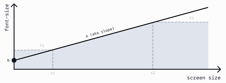
This is what we call a linear function. The line starts at b, or the base. This is the value you get when the screen has a width of 0.
f = b + a * s
root: {
  --step-0: clamp(f1, calc(b + a * s), f2);
}
Determining the values of a and b can be achieved using the two reference points we determined earlier.
     f2 - f1
a = ---------
     s2 - s1

b = f1 - a * s1
Implementing it in CSS #
But these are the mathematical formula. There are some gotchas when implementing this in the clamp() function or in CSS in general. In mathematics, To make everything work with calc(), small tweaks and implementation details are needed.
The CSS calc() function has several gotchas to take into consideration:
- Its output is always in
px - When dividing, the bottom half of the divide should be unit-less
- When multiplying, one of the two sides should be unit-less
To work with calc(), we have to use pixel values, but without the px. This is known as unitless. When we have a unitless value for a and b, we can transform the latter to a value using rem. We can do this by dividing it by the assumed value of 1rem. But, again it has to be unitless. We can do the same with the original f1 and f2 values.
We are now almost there! We need to convert a * s to something implementable in CSS. Given how CSS works, this value should either be a percentage or a vw value. As we want to use the screen width, let’s use a vw value. In the linear function we determined, s represents the entire screen, i.e. it is always 100vw. This means that we can determine a * s can be set as:
         f2 - f1
a * s = --------- * 100vw
         s2 - s1
Note that in the above function, we still assume the unit-less f1 and f2 in px values. Not the values converted to rem. Combining everything results in the CSS code below.
root: {
  --f1: 16;
  --f2: 20;
  --s1: 320;
  --s2: 1240;

  --a: calc((var(--f2) - var(--f1)) / (var(--s2) - var(--s1)));
  --b: calc(var(--f1) - var(--a) * var(--s1));

  --step-0: clamp(1rem, calc(var(--b) + var(--a) * 100vw), 1.25rem);
}
We have made it! As you can see I filled in some values to make the code more readable. Otherwise we would have to put calc(var(—f1) * 1rem / 16) as the first parameter. It was a journey, but we have finally determined how to reproduce the one generated custom property for fluid layouts. Phew!
A different approach #
Even now, I feel overwhelmed. There is a lot of code and in-between variables required to create one custom property. If you have no harmony between the different properties (e.g. each step scales with 1.33), you are gonna have a bad time. I believe there is a simpler method, that produces the same result. For me, this different approach makes things more maintainable. Especially when you have harmony between your steps. Let’s take a look!
The key difference in this approach is that we are not going to reproduce the linear function as visualized before. In this approach, we define a linear function where b = f1 and a = f2 - f1.
f = f1 + (f2 - f1) * r
Notice the newly introduced r or ratio. This variable stands for the ratio. It represents a value between 0 and 1 showing where we are between the minimum and maximum screen size. In the function below the s represents the screen size. The min(s, s2) ensures that ratio remains between 0 and 1 even when we have a large screen.
	       min(s, s2) - s1
ratio = -----------------
	          s2 - s1
When we use the same basic parameters as before, we can calculate the ratio value. As before, the parameters for s1 and s2 are unitless due to the limitations of the calc() function.
root: {
  --s1: 320;
  --s2: 1240;

  --ratio: calc((min(100vw, 1240px) - 320px) / (1240 - 320));
}
You can see that we multiply the parameters with 1px on the left-hand side. This is because we are working with the min() function and 100vw. The output is in px values, so the rest should be as well. This means that in reality, --ratio is a value between 0px and 1px. But that is not a problem, as our f1 and f2 are defined unitless. Combined, we have the results we want!
:root {
  --f1: 16;
  --f2: 20;

  --step-0: calc(1rem + 4 * var(--ratio));
}
As you can see, no need for clamp(). We start at the minimum font-size value with calculating. And due to the use of min() we ensure we do not exceed our maximum screen size. In my view, a more maintainable way to create fluid custom properties. Full example can be found here.
Wrapping up #
Both approaches have up- and downsides. The first approach requires more complex calculations. Each step requires calculating the a and b separately from the other steps. This adds a lot of maintenance overhead, even when using SCSS or SASS. The second approach only requires calculating the --ratio once. No other calculations outside the steps themselves are required. But, the --ratio cannot be generated and needs to live in the
root.
Both are valid approaches. I suggest you use harmony between the f1 and f2 values of a size consistently. So for each step, define f2 = 1.2 * f1 for instance. Next, create harmony between the steps (e.g. step-1 = 1.33 * step-0). If you do this, both approaches can be implemented in a maintainable fashion. If you have more settings for your steps, choose the first approach with generated code.